Posts Tagged ‘Data Challenges’
What Are Some Children’s Data Needs in Los Angeles County?
 On a recent trip to Los Angeles, we had an opportunity to hold a roundtable discussion with deputies from various county departments.
The topic of discussion? Data, of course. And, more specifically, how our foundation and kidsdata.org might be able to help with any gaps or needs regarding child health data in the county. We weren’t just talking about topics of data that are needed — that list surely would be infinite. We also spent the time sharing ideas about how data use might be better facilitated. The attendees — representing county departments such as juvenile justice, social services, public health, maternal and child health, and more — noted a number of key areas:
- Integrating public assistance data: It would be helpful, for example, if we knew how many students who drop out of high school are also on some form of public assistance.
- Sharing data across county departments: Some attendees suggested finding a central place to offer the county departments’ state-mandated reports for public consumption.
- Offering data at a more local level: This is a common refrain we hear when meeting with people in Los Angeles. We don’t currently offer data on kidsdata.org more locally than by city or school district, but we’re open to considering the possibility of even more local data. (Read our blog post about The Quest for Local Data)
- Data for transitional-age youth: Across many departments, these data are valuable — for homeless youth, youth with disabilities, and youth in foster care.
We’ll give these good ideas consideration, and see what may align with our statewide work with kidsdata.org. And if you are from Los Angeles, let us know via a comment what additional priorities you would you recommend we consider. Stay tuned to this blog for updates on our ongoing work to meet children’s data needs in Los Angeles County and statewide.
Posted by Felicity Simmons
Tags: Data Challenges
Some Data Now Available by Legislative District
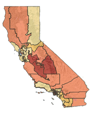 This week, we added a range of demographic and economic data for every Congressional, Assembly, and State Senate district in California — nearly a dozen measures of child health — to kidsdata.org. (See the data we added)
Our colleagues across the state tell us that local data help them the most — and the more local the better. On kidsdata.org, we already offer data for many topics at the city and school district level. The addition of data by legislative district means we can show data for many more regions across California — over 1,800 in all. In addition, we’ve heard from elected officials and their staff that hard data for their district would help them do their jobs better. By providing these data, we hope to help fill that need.
Currently, there are more than 400 measures of child health available on kidsdata.org. So, why are so few available by legislative district? The short answer: Only some data are collected that way. These legislative data, in fact, are drawn from recently posted data from the Census Bureau’s American Community Survey; these data weren’t even available a year ago. We hope this addition to kidsdata.org helps policymakers improve the lives of children in their districts.
Another site that offers data by legislative district, for both children and adults, is Healthy City. If you know of other resources, or other data available by legislative district, please note them below.
Posted by kidsdata.org
Tags: Data Challenges, New Data
Public Data’s New-Found Freedom
 The author of the emancipation proclamation for health data.
That’s what Matt Miller, host of NPR’s “Left, Right & Center,” dubbed Todd Park at a national Health Data Initiative Forum in Bethesda, MD on June 9.
Park, chief technology officer for the U.S. Department of Health and Human Services (HHS), was instrumental in making HHS’s wide-ranging data offerings much more accessible, and is a pivotal figure in the federal government’s open data initiative.
Miller’s emancipation theme was pervasive at this one-day, Institute of Medicine forum. Speakers noted that at last year’s inaugural conference, technologists, communicators, and policymakers were trying to make sense of what to do with public data’s new-found freedom.
 In just one year, Miller noted, numerous mature apps have emerged that utilize health data from the federal government in innovative and important ways. Many of these were featured at the forum, including Ozioma, which makes cancer-related data available to media; the Foodborne Disease Outbreak Investigation System, a public-private collaboration to investigate disease outbreaks; and Asthmapolis, which provides real-time data on asthma by tracking when – and where – people use their inhalers.
But while there are reasons for optimism, there were some pointed reminders, too, about the need to focus even more on how best to use all the data the federal government is releasing. For example, Harvey Fineberg, president of the Institute of Medicine, quoted Samuel Coleridge’s famous quote, “Water, water every where, nor any drop to drink.” Noting that “we’re “afloat in a sea of data,” Goldstein said that “information shall set you free, but only if you can use it.”
HHS Secretary Kathleen Sebelius pointed out that 30 years ago, “You often had little data; you made policy by anecdote.” Today, the situation is the same, she said, urging attendees to use data to help improve both health care costs and outcomes.
To help organize the burgeoning national interest in health data, HHS, the Institute of Medicine and the Robert Wood Johnson Foundation announced the formation of a national Health Data Consortium to help the country understand the power of health data and harness these data to make the U.S. a healthier nation. In addition to the organizations above, some of the other 15 founding members of the Health Data Consortium include our foundation, the California Health Care Foundation, Consumer Reports, Grantmakers in Health, and the National Association of Counties.
Posted by Andy Krackov
Tags: Data Challenges, Data Projects
Developers Find Intriguing Ways to Display Data from Kidsdata.org
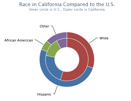 |
Innovative data displays like this one are featured in the winning team’s entry. |
In the spirit of this week’s World Wide Developers Conference in San Francisco, we’d like to announce the winner of kidsdata.org’s recent developer challenge.
In partnership with Health 2.0, our foundation challenged developers and designers to use data from kidsdata.org to create compelling summaries that draw attention to key problems affecting the health and well being of children. Teams were asked to use their creativity in making data about children engaging and easy to understand in any format they chose – a mobile or web application, visualization or game – the goal being to promote action from policymakers, advocates and other stakeholders.
This online challenge is part of a national initiative to foster broad interest in public data, and all the submissions we got for our challenge provided us with interesting perspectives on how we can present data from kidsdata.org. We also participated in a live challenge, or code-a-thon, earlier this year.
The big winner for our foundation’s challenge is Team Big Yellow Star, for its interactive tool Mapping Health, a web-based application that allows users to explore different health indicators by state, county and race/ethnicity, with the goal of revealing racial disparities and areas of improvement. The site consists of four informational sections: state level data, state demographics, county level concerns and race/ethnicity and location.
Many thanks to our judges, subject experts from across California:
- Ramin Bastani, founder and CEO of Qpid.me
- Toby Ewing, consultant for California’s Senate Governance and Finance Committee
- Louis Freedberg, senior reporter for and advisor to California Watch
- Wendy Lazarus, founder and co-president of The Children’s Partnership
- Rosie Mestel, editor, Health and Science for the Los Angeles Times
You can learn more details about the Local Children’s Data challenge here, and more details about the Health 2.0 Developer Challenge here.
Posted by kidsdata.org
Tags: Data Challenges, News About Kidsdata.org
Linking Data to Policy
The percentage of California kids living below the federal poverty level has increased in recent years.
In ‘09, there were more than 90,000 substantiated (verified) cases of child abuse/neglect in the state.
About 42% of low-income children/youth ages 5-19 were overweight or obese in California in ’09.
What can be done about these issues?
We’re beginning to address this question through a new enhancement to kidsdata.org: the inclusion of policy implications alongside each topic on kidsdata.org. These narratives describe promising and research-based policy and program ideas, conveying the message that problems revealed in the data can be addressed.
This new section has already launched for several topics, including child abuse, weight and fitness, free and reduced price school meals, and health care. It’s coming soon for all other topics.
Through this new content, our foundation aims to present a range of policy options for which there is evidence of success, and emphasize what children need to flourish in any particular area.
Posted by kidsdata.org
Tags: Data Challenges
Case Study: Use Google’s Free Tools to Animate Your Data
Originally posted on the Nonprofit Technology Network blog
At the Lucile Packard Foundation for Children’s Health, we publish data on children’s health and well being in California through our own www.kidsdata.org website. The site makes it easy to find, describe, and share wide-ranging facts – millions of data points in all – about how kids in California are faring.
With a robust data website like ours, why, then, would we want to make use of Google’s own data offerings, as we did on this blog post about the rise in autism diagnoses (http://www.kidsdata.org/blog/?p=2113)? In short, the charts that Google makes available are slick, especially in the way they animate data, and Google’s tools can be of benefit to wide-ranging nonprofits that work with data.
In our case, Google’s chart animation allowed us to clearly communicate the increase over time in autism diagnoses, as compared to other special education diagnoses. In the post above, click on the bar graph tab in the 2nd graph, then press play to see how Google makes it easy to animate data. The effect can be quite powerful and attention-grabbing, which is a key consideration for an organization like ours working to raise the priority of children’s health.
It’s relatively easy for nonprofits to create these charts: Just upload your own data into Google Docs (the data can be on any topic of interest to your organization), build your animation, then grab the code to put on your site/blog. Even better, Google offers this service for free (other than the roughly 30 minutes to an hour it will take you to build your animated chart).
In addition to integrating these charting capabilities into Google Docs for individual users, the search giant also is building out a comprehensive site, Google Public Data Explorer, which, so far, offers dozens of indicators from data sources worldwide.
Our foundation is experimenting with Google’s Public Data Explorer, too (nonprofits can upload public data into this system). Our thinking is that if we can make data available through Google itself, we may get even more exposure to the issues to which we’re trying to bring attention.
Unlike Google Docs, however, we’ve found that Google’s system to upload data into Public Data Explorer – called Dataset Publishing Language (DSPL) – is somewhat cumbersome to use, requiring us to have at least some programming knowledge. This requirement has slowed us down, but we’re still trying to figure out how this new language works, especially as Google transitions DSPL into something more user-friendly for those uploading data.
The upside of using Public Data Explorer is too significant for us to ignore. After all, given its reach, Google has the capacity to draw more attention to our data than we potentially can through kidsdata.org (the same surely applies to most nonprofits). And, once these data are uploaded, Public Data Explorer offers some engaging data displays. So we’re hoping that Google will simplify the upload process for Public Data Explorer – that is, the DSPL language – to the point where it will be worth our time to add our data to Google’s own site.
Posted by Andy Krackov
Tags: Data Challenges
Federal Data Resources In Jeopardy
 As the Federal government struggles to vote on a budget that affects many programs for children, we note some valuable data resources that may be in jeopardy.
According to the Sunlight Foundation, Federal data transparency tools such as data.gov, usaspending.gov, and the IT Dashboard are at risk of having most of their budgets cut. The cuts are so drastic that they might mean the elimination of these programs altogether.
Websites such as these have been used by journalists to shed light on government spending, and offer context to health issues.
Here at kidsdata.org, we value these trusted public data sources and hope they can be retained. On its website, the Sunlight Foundation offers may ways you can voice your opinion on these proposed cuts.
Posted by kidsdata.org
Tags: Data Challenges
Make Your Case with Compelling Facts
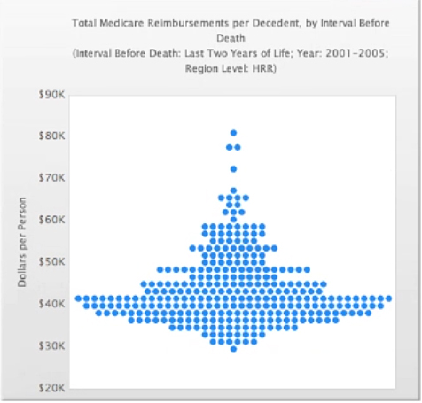 |
This “turnip” or “space invader” graph was one of the data visualizations highlighted in the session. |
Recently, I had the pleasure of moderating a session about data at the Nonprofit Technology Conference in Washington, D.C. This annual conference explores trends in technology that affect nonprofit work, and this session focused on making your case with compelling facts.
Given that the audience for this conference is exclusively nonprofits, we knew that every attendee needs data — whether they want it or not. All kinds of nonprofit work — advocacy, grantseeking, and even reporting to a board of directors — require data. But, that doesn’t have to mean run-of-the-mill excel graphs or, even worse, text-heavy pdfs. There are so many intriguing and, in some cases, inexpensive, ways to tell your story through data. Here are some that we featured in the session:
Two of our expert panelists came from Velir Studios, the web firm behind kidsdata.org and many other data sites, such as KidsCount, Kaiser State Health Facts, and the Dartmouth Atlas of Health Care. See the video of their presentation, which includes mapping examples and many other data visualizations.
Perhaps the biggest question of the day was: how can I do this for free/on-the-cheap? Several Google tools were mentioned as low-cost and easy-to-understand data displays. Google Chart Tools offers a wizard for creating several types of dynamic data displays, and Google’s Public Data Explorer allows you to upload your own data, create your own visualizations, and then share what you’ve done with the masses.
Other free, inexpensive, or at least easy-to-use tools that were noted included Tableau Public (there’s also a server edition for more sophisticated developers); Socrata, which can help you offer your data publicly; and mapping tools such as GeoCommons, and IndieMapper. Additional resources are included in this handout from the session.
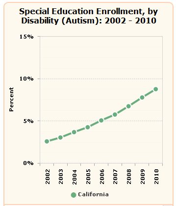 And, of course, no data session would be complete without some display examples from kidsdata.org. Andy Krackov, our Assistant Vice President of Programs & Partnerships, pointed out some tips for communicating data, noting that kidsdata.org makes it easy to monitor trends, like the graph on the left, and identify disparities.
In addition to these data visualization examples, the session included in-depth discussions about several related topics:
- How data and personal stories can come together to make your case even more compelling. See a blog post on this topic by session panelist Kurt Voelker from Forum One Communications.
- How to find data within your organization that others may be interested in (it can be anywhere — grant reports, web analytics, etc.) and, once you’ve found it, whether or not you should release it. (You should err on the side of releasing it.)
- If you have a mountain of data, how you can decipher what’s important. (Focus on your mission.)
- How to use data in your story, but still keep your story interesting
The discussion continues on Twitter via the hashtag #11ntcdata. Feel free to post questions there or here. And, if you know of other compelling data visualizations not listed here, or other free tools and resources, please let us know.
Posted by Felicity Simmons
Tags: Data Challenges, Data Projects
At Health 2.0, Data + Technology = Problem Solving
 It’s amazing what can be accomplished in one day when great minds come together to find new ways to address health issues.
About a week ago, kidsdata.org participated in a code-a-thon sponsored by Health 2.0 and the U.S. Department of Health and Human Services. For those who don’t know, a code-a-thon is essentially a hack-fest — a bunch of coders come together, divide into teams and spend one day building websites, apps, and other technology to tackle problems.
This time around, all the problems focused on health, and about 100 developers turned out. By the end of the day, we saw novel approaches to some serious health issues, including: motivating people to exercise or eat right, developing useful school health records for kids with special needs, and taking advantage of free services available through health reform. A short summary of all the projects developed is available in this blog post on applicationsforgood.org, but here’s a snapshot of one that particularly interested us:
One team from Capito Life Technologies came up with an approach for tracking health records at school for children with special health care needs, and then using those records to keep parents and doctors informed of a child’s condition. Using data from kidsdata.org, the team determined that asthma is one of the most common conditions facing this population of children. (42% of kids with special needs in California have asthma.) And, asthma is a condition that affects a large population of children in California — about 15% — and often must be treated during the school day.
The coders developed an online school health records system, so that all of a student’s health information could be stored in one place. The system also would include information about what medications the student is taking, and the prescribed dosages. If a student visited the nurse’s office due to an asthma attack, for example, a nurse could use the online system to record the student’s condition, and note any medication that was given, as well as the outcome. The system would then send a text message to that student’s parent to keep them up to date on their child’s condition. All the information in the system would be secure and password-protected, and also available for download for a physician or parent.
Amazingly, the team built that entire system in about 7 hours at the code-a-thon.
Maybe it was the inspirational surroundings (the event was held at the Google campus) or maybe it was the competitive spirit among the developers, but everyone at the event was passionate about improving health through technology. And, as you can see, real solutions were created.
Posted by Felicity Simmons
Tags: Child Health Issues, Data Challenges
SacBee Op-Ed: Student-Level Data Are Needed
We recently came across this opinion piece from the Sacramento Bee and, given its data focus, thought it might be of interest.
Written by former state legislator Dede Alpert and former state superintendent of public instruction Jack O’Connell, the article outlines the need for a tool to measure student progress over time. While California has such a system — the California Longitudinal Pupil Achievement Data System (CALPADS) — funding has been cut to support it.
In encouraging the state Legislature to restore funding for the system, Alpert and O’Connell note the following:
“Now more than ever, accurate student information is needed for sound decision-making, transparency, accountability and good stewardship of taxpayer dollars.
Read the entire article, as well as comments supporting and opposing the system, here.
Posted by kidsdata.org
Tags: Data Challenges, Data Projects


