Introducing Kidsdata.org’s New Data Manager
Here at the Lucile Packard Foundation for Children’s Health, we’re thrilled to welcome a new member to the kidsdata.org team.
Regan Foust, PhD, is our new data manager, and will lead all things data. Regan will make sure that the data on kidsdata.org are continually updated, both to ensure the quality and usefulness you’ve come to expect from our site.
A seasoned researcher, Regan holds a doctorate in educational psychology from the University of Virginia, and comes to the foundation from Sociometrics, a research and development firm specializing in social science research. She has extensive research and evaluation experience in the fields of education, child welfare, and mental health, and she is excited to help kidsdata.org users understand and make use of our child health data.
Regan can answer any questions you might have about the data available on kidsdata.org — or what’s coming. Feel free to e-mail her – or any of us on the kidsdata team – at [email protected].
Posted by JoAnna Caywood
Tags: News About Kidsdata.org
Some Recent Top Stories in Children’s Health
Here are some news articles from the last few weeks that focus on children’s health issues, along with related data from kidsdata.org.
Births (See related data)
- Home Births Rise Due to Natural Birth Subculture Among White Women, Government Data Show
(SF Chronicle, 5/19/11, by Stobbe)
Cancer (See related data)
- Article Explores Impact of Childhood Cancer on Families
(NY Times, 5/23/11, by Barrow)
Demographics (See Related Data)
- Census Finds Fewer Children, Traditional Families in California
(Sacramento Bee, 5/25/11, by Walters)
Mental Health (See Related Data)
- Study: Treating Depression in Moms Has Significant Impact on Mental Health of Children
(WSJ, 5/17/11, by Beck)
Special Health Care Needs (See Related Data)
- Experts Debate the Risks of Medicating Children for Behavior Disorders
(CNN, 5/23/11, by Park) - Parents of Special Needs Children Must Plan for Current, Future Financial Costs
(Sacramento Bee, 5/24/11, by Lofing)
- Prenatal Vitamins Reduce Autism Risk By Half, Even More for Some Higher-Risk Cases, Researchers Say
(LA Times, 5/25/11, by Maugh)
Weight (See Related Data)
- Study: Childhood Diet Decisions Make a Big Difference in Later Years
(LA Times, 5/15/11, by Bunker)
Posted by kidsdata.org
Tags: Child Health Issues
Slideshow: How Physically Fit Are California Students?
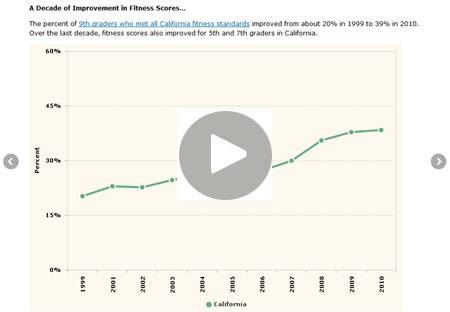
Depending on the gender and grade, about 25% to 40% of California students meet all six of the state’s fitness standards. And while the percent of 5th, 7th, and 9th graders who met all of these fitness standards has been improving over the last decade, fitness scores in California largely leveled off between 2009 and 2010. View this slideshow to learn more>>
Posted by kidsdata.org
Post Comment
2010 Fitness Results: Is a Slow-Down in Improvement a Momentary Blip?
When analyzing public data, don’t you often yearn for the next year of data – just one more year to help inform a phenomenon you may be seeing? A case in point is the recently released fitness data from the California Department of Education, where 2010 results seem to show a somewhat different story from previous years’ results.
From 2006 to 2009, the percentage of California 5th, 7th, and 9th graders meeting all six state fitness standards increased by about 2 percentage points annually on average, contributing to a decade-long improvement in this measure of kids’ fitness. Then, from ’09 to ’10, that improvement appeared to stall, in the form of a 0.5 percentage point increase on average for 5th, 7th, and 9th-graders in California.
Is this possible slow-down in improvement only a momentary blip? Or are we perhaps starting to see repercussions from the recession and the state’s budget woes? Over the last few years, school districts statewide have been forced to make do with less. Given budgetary demands, some districts surely are finding it more difficult to meet state requirements stipulating how much physical education students need (see this related article from the Orange County Register, as well as this editorial from Los Angeles Times). Moreover, cities across the state regularly face cutbacks that possibly mean reductions in the park and recreation services they offer.
These factors may be contributing to the small improvement in fitness scores from 2009 to 2010. But to determine what is really going on, we need 2011 data and additional analysis from the experts.
Meantime, the local perspective can help shed light on the statewide results. So we encourage our readers across California to post a comment describing what they’re seeing. Are there cutbacks to programs that provide physical education – or outdoor playtime – to children locally? If so, what kind of impact are you seeing?
Posted by Andy Krackov
Post Comment
Spotlight on Asian American and Pacific Islander Children
 |
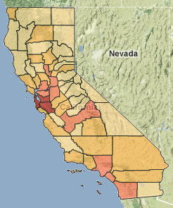
This map shows the Asian/Pacific Islander child population of California. The counties with the highest percentage of Asian/Pacific Islander children are in the Bay Area. |
In honor of Asian-Pacific American Heritage Month, we’re highlighting related data about this population of children in California. These data come from kidsdata.org, and if you know of other sources of data or information about Asian American or Pacific Islander kids, we encourage you to add those here.
- About 10% of California’s child population is Asian or Pacific Islander, just over 1 million children.
- In California, about 12% of Asian American children and 17% of Pacific Islander children are living below the federal poverty level, according to ’09 data.
- In ’06-’08, roughly 24% of Asian American and Pacific Islander 7th, 9th and 11th graders said they had been bullied at school at least once in the past year due to their race.
- The teen birth rate among Asian American/Pacific Islanders in California consistently has been lower than that of other racial/ethnic groups for which data are available, according to 1995-2007 data.
Visit kidsdata.org for a summary of data available for Asian American and Pacific Islander children in California, and to compare data across demographic groups.
Also see kidsdata.org’s Research & Links section, which offers key reports about these and other demographic groups.
Posted by kidsdata.org
Tags: Health Observances
Linking Data to Policy
The percentage of California kids living below the federal poverty level has increased in recent years.
In ‘09, there were more than 90,000 substantiated (verified) cases of child abuse/neglect in the state.
About 42% of low-income children/youth ages 5-19 were overweight or obese in California in ’09.
What can be done about these issues?
We’re beginning to address this question through a new enhancement to kidsdata.org: the inclusion of policy implications alongside each topic on kidsdata.org. These narratives describe promising and research-based policy and program ideas, conveying the message that problems revealed in the data can be addressed.
This new section has already launched for several topics, including child abuse, weight and fitness, free and reduced price school meals, and health care. It’s coming soon for all other topics.
Through this new content, our foundation aims to present a range of policy options for which there is evidence of success, and emphasize what children need to flourish in any particular area.
Posted by kidsdata.org
Tags: Data Challenges
Another Look at Autism Diagnoses
A new report from the Centers for Disease Control notes that rates of autism and ADHD among children are on the rise.
Earlier this year, we wrote a blog post about 2010 special education data for school districts across California. In light of the just-released CDC study, that blog entry is re-posted below.
Originally posted Feb. 3, 2011
A few years ago, we published an issue brief, “Autism Diagnoses on the Rise,” that explored the steep climb in autism diagnoses across California. So what does the trend look like these days? About the same, it turns out. Newly released data from the California Department of Education show that the growth in special education students diagnosed with autism continues unabated, from roughly 17,500 California public school students in 2002 to nearly 60,000 in 2010.
As you dig deeper, however, some other trends emerge. First, while students with autism comprise a greater share of all special education students in California compared to roughly a decade ago (from about 3% of all special education students in ’02 to about 9% in ’10), numbers are on the rise for another diagnosis, too — “other health impairment.” The California Department of Education defines this as “having limited strength, vitality or alertness, due to chronic or acute health problems, such as a heart condition, tuberculosis, rheumatic fever, nephritis, asthma, sickle cell anemia, hemophilia, epilepsy, lead poisoning, leukemia, or diabetes.” Meanwhile, the percent of special education students diagnosed with a learning disability has dropped considerably, from 52% of all special education students in 2002 to 42% in 2010.
This Google animation, which uses data from kidsdata.org indicators, shows the relative growth/decrease in special education enrollments by the three conditions noted above. First click on the bar graph icon in the top-right, then press play in the bottom left.
We encourage our readers to provide some perspective on these trends. We do know that research shows that federal and state finance reform may be contributing to declining learning disability rates in California (and across the nation). As for autism, the Centers for Disease Control and Prevention says that whether the increases are “attributable to a true increase in the risk for developing ASD [autism spectrum disorders] symptoms or solely to changes in community awareness and identification patterns is not known.” Comments from users like you can help us illuminate what’s going on both locally and statewide, and provide broader perspective on the growth in autism diagnoses.
Posted by kidsdata.org
Tags: CSHCN
Top 10 Health Achievements This Century
 The Centers for Disease Control and Prevention (CDC) has put together a list of the top 10 public health achievements in the first 10 years of the new millennium. The list was chosen by CDC public health scientists. In no particular order, here are 10 great accomplishments from 2001-2010:
- Vaccine-Preventable Diseases (see local data on immunizations)
- Prevention and Control of Infectious Diseases
- Tobacco Control (see local data on teen smoking)
- Maternal and Infant Health (see local data on infants)
- Motor Vehicle Safety (see local data on drinking and driving)
- Cardiovascular Disease Prevention
- Occupational Safety
- Cancer Prevention (see local data on childhood cancer)
- Childhood Lead Poisoning Prevention (see local data on poisoning)
- Public Health Preparedness and Response
All of the above have an impact on the health and well being of children and families. Read more here. Is there anything you’d add? Or remove?
Posted by kidsdata.org
Post Comment
A Portrait of Well Being in California
 Here at the Lucile Packard Foundation for Children’s Health, we’re always on the lookout for compelling uses of data, so we took note of a report released this week by the American Human Development Project, “A Portrait of California.”
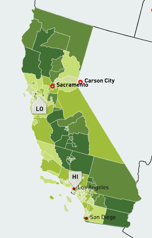
The report examines the well being of the people of California, using the American Human Development Index. Accompanying the index are interactive maps that show dozens of measures of health, including child poverty, life expectancy at birth, school enrollment, unemployment, and much more. Users also can find data by county, zip code, metro area, and even legislative district.
Here are a few highlights noted in the report’s fact sheets:
- Within the San Francisco metro area, life expectancy at birth ranges from 85 years in the San Mateo communities of Burlingame and Milbrae to only 74 years in the Elmhurst section of Oakland, an 11‐year gap within the same metro area.
- In Los Angeles, personal earnings are highest among whites, at $43,000 per year, followed by $35,000 for Asian Americans, $30,000 for African Americans, and $21,000 for Latinos.
- In the San Joaquin Valley, over 28 percent of adults have not completed high school.
See what’s happening in your community>>
Posted by kidsdata.org
Tags: Data Projects
The Skinny on Using Data for Telling Stories, Raising Funds, and Pushing Your Mission
 As you may have seen, our foundation’s Andy Krackov recently wrote a guest blog post on the Nonprofit Technology Network’s blog about using Google’s free tools to animate data.
Turns out, the NTEN blog’s May theme is all things data – fundraising with data, telling stories with data, showing data in compelling ways, and much more. What could be more exciting?! Here’s a sampling of their posts:
- First, NTEN Executive Director Holly Ross tackles the issue of proving your organization’s impact through data. She discusses a four-step approach to making the most of your data: defining data, giving it meaning, using it to tell a story, and then sharing it with other organizations. Read more>>
- A guest post by Colin Holtz and Steve Daigneault of M+R Strategic Services about storytelling with data notes that sometimes the most compelling stories don’t have the most impact. Often, a more data-driven, conventional approach can better outline your accomplishments and needs, the authors say. Read more>>
- Another post from Jeff Stanger of the Center for Digital Information discusses the difference between data and information, noting that data come from research, and information comes from the communication surrounding those data. And, says Stanger, technology is constantly changing the way we collect and communicate data. Read more>>
- Most recently, NTEN Publications Director Annaliese Hoehling encourages us to think about the people behind our data, noting that data has “infinite potential for stories.” Read more>>
Kudos to NTEN for discussing so many different aspects of data in such a thoughtful way. Visit the NTEN blog for even more posts about data this month.
Posted by Felicity Simmons
Post Comment


